

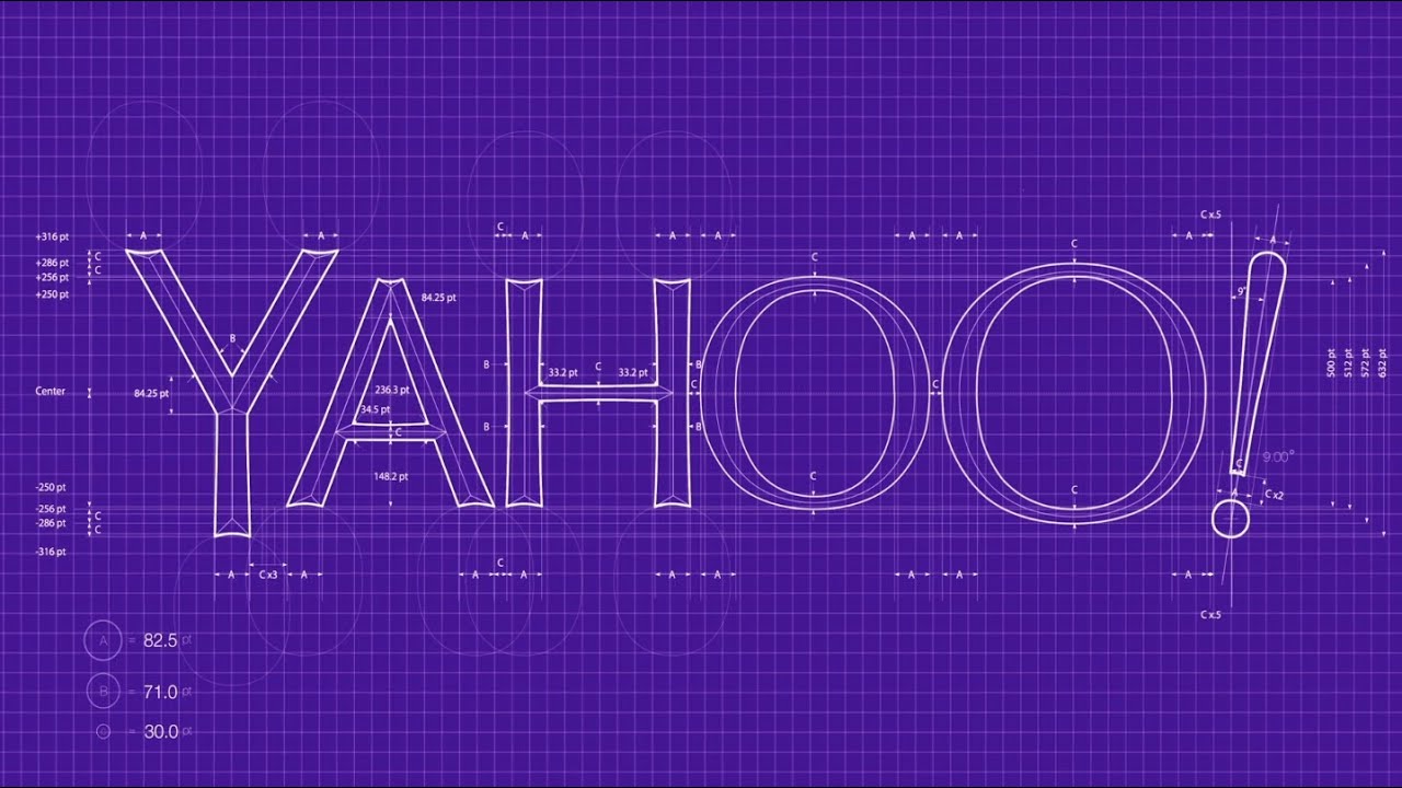
Yahoo! global logo redesign rollout: a case study
Late 2013 Yahoo changed their iconic logo and rebranded itself. The rollout was proceeded with a month in which the logo had to change every day on all main Yahoo properties. On the 30th day the new logo would be revealed and rolled out on every single Yahoo! Property world wide.
The challenge
I was put in charge of all UX related efforts to make all this happen. There was no plan and there was no final logo design until 10 days before the already announced reveal date because Marissa Mayer had not made up her mind yet about what it should look like.
30 Days of Change
In order to get the audience excited or at least aware of the fact that the Yahoo! brand was about to change dramatically it was decided that the most important Yahoo! properties would have a different logo every single day for an entire month. On the last day the actual new logo would be revealed. 12 properties, various web formats, 1x and 2x resolution, mobile formats, lockups with property names in many different languages required several thousands of graphic assets to be created and deployed on a daily basis.
There was NO plan except for a small army of UXers hand-creating all these assets.

I ended up creating a tool that would accept one high fidelity logo image and generate all assets needed for every day of this special month.
- Various formats (GIF, JPG, PNG)
- Web sprites (light and dark, multiple graphics in one file)
- Lockup with property name (Yahoo! Sports, Yahoo! news, entertainment etc.)
- Various languages including RTL (Arabic etc.)
- “Retina” (2x) and regular resolution for every asset
Partner lockups
While “30 Days of Change” was in full swing, engineering had taken my image generation tool to use as a starting point for a more comprehensive image generation tool and I was put in charge of all “partner logo lockups” which could not be generated with my initial tool so the idea was to hand craft them with a team of designers lead by me.
- Yahoo logo
- Partner logo
- Property names
- Additional graphics
- Many languages
- Many graphic formats, just like in 30 days of change
There were several hundreds of partner logo lockups.
When whiteboarding out the problem we realized we needed 48 different variations of each.
The assets needed to follow a strict file naming convention that was extremely prone to error when done manually.
E.g. yahoo_news_en-IN_s_f_pw_351x40_news_2x.png
Once the final logo was revealed we had less than 10 days left for a small team of overworked UXers and thousands of assets to create.
I went home early that day trying to figure out how I was going to get my team out of this impossible situation…
Through the night I created another tool that would take hand-crafted partner lockup designs and generate out 48 variations for each of them, following the exact file naming convention as needed by engineering.
When I came back the next morning, the mood changed!
The final rollout
We successfully rolled out the new Yahoo! logo, pushing a grand total of over 200,000 graphic asset with the push of one button. These were created and pushed in just 10 days by a small team of UX designers and engineers.
“Project Swan” was a ringing success.